Blog - Building and Using Deal Charts
Explore our blog for practical advice on data discovery, data visualization, and last-mile data delivery across structured finance use cases within the context of a metadata-first data strategy. Discover how-to posts, ChatGPT prompt guides, and other valuable content to enhance your data analysis and presentation skills.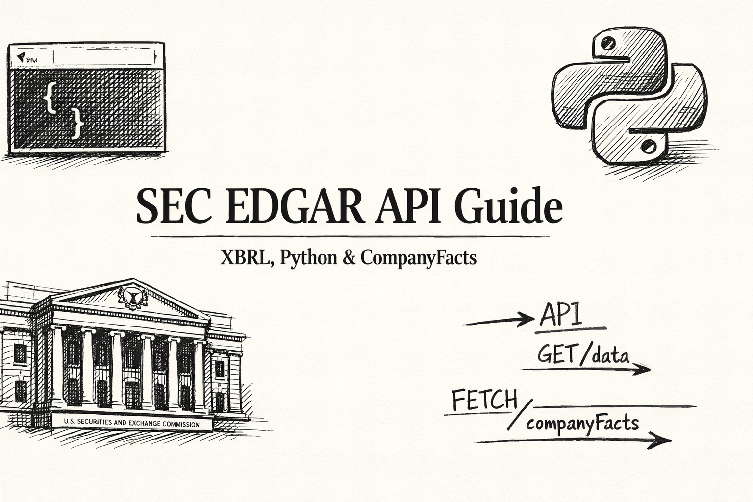
SEC EDGAR API Guide: XBRL CompanyFacts, Rate Limits & Python Examples
Complete guide to the SEC EDGAR XBRL API — CompanyFacts endpoint, 10 req/s rate limit, User-Agent requirement, Python examples, CIK lookup, and common errors.
A Data-Driven Guide to CMBS Loans and Securitization
Learn what CMBS loans are and how securitization transforms commercial mortgages into tradable bonds. Understand data lineage from SEC filings to verifiable insights.

Unlocking Student Loan Asset Backed Securities with Programmatic Analysis
Learn how to analyze student loan asset backed securities programmatically. Understand SLABS data lineage from SEC filings to verifiable risk models.
A Quants Guide to the NCREIF Property Index
Learn how to programmatically access and apply NCREIF Property Index data to CMBS analysis. Understand NPI data lineage for verifiable risk models.
How Real Estate Data Analytics Powers Modern Structured Finance
Learn how real estate data analytics transforms structured finance. Understand programmatic workflows for CMBS and ABS analysis with verifiable data lineage.

A Data-Driven Guide to Student Loan Backed Securities
Learn how to analyze student loan backed securities programmatically. Understand SLBS data lineage from SEC filings to verifiable risk models.
A Deep Dive into CMBS Delinquency Rates for Programmatic Analysis
Learn how to track and analyze CMBS delinquency rates programmatically with verifiable data lineage. Understand credit performance metrics for commercial mortgage-backed securities.
A Deep Dive into the Debt Service Coverage Ratio DSCR for Structured Finance
Learn how to calculate and analyze the debt service coverage ratio DSCR programmatically for structured finance. Build verifiable risk models with clear data lineage.
Defeasing a Loan: A Data-Driven Guide for Structured Finance Analysts
Learn how defeasing a loan works in structured finance and how to programmatically track these events with verifiable data lineage for CMBS analysis.

Programmatic Guide to the Definition of Mortgage Backed Securities
Learn the definition of mortgage backed securities from a programmatic perspective. Understand MBS structure, data sources, and analytical workflows for structured finance.

Understanding the Fannie Mae Conservatorship in Structured Finance
Learn about the Fannie Mae conservatorship and its impact on agency MBS markets. Understand data lineage from regulatory filings to programmatic risk analysis.
Deconstructing the Interest Rate Cap in CMBS Deals
Learn about interest rate caps in CMBS deals and how to programmatically extract and verify cap parameters from SEC filings for risk modeling.

Refinancing Commercial Mortgage: A Programmatic Approach to Risk and Opportunity Analysis
Learn how to programmatically analyze commercial mortgage refinancing with verifiable data lineage for CMBS surveillance and risk modeling.

Mastering Risk Management Securities for Programmatic Analysis
Learn how to programmatically analyze risk management securities with verifiable data lineage from SEC filings to actionable insights for CMBS and ABS.

Understanding the Tenant Improvement Allowance in CMBS Data
Learn how to programmatically extract and analyze tenant improvement allowance data from CMBS filings for accurate risk assessment and cash flow modeling.
What Is a CMBS? A Data-Driven Guide to Commercial Mortgage-Backed Securities
Learn what a CMBS is from a data-driven perspective. Understand CMBS structure, data sources, and programmatic analysis workflows for structured finance.
Decoding the Triple Net Lease: A Guide for Structured Finance Analysts
Learn about triple net leases in CMBS and how to programmatically identify and analyze NNN lease structures from SEC filings for risk modeling.
Yield Spreads: A Programmatic Guide for Structured Finance Analysts
Learn what a yield spread is and how to programmatically calculate and analyze yield spreads from SEC filings for CMBS and ABS risk monitoring.
Tracking FDIC Problem Banks for Structured Finance Risk Analysis
Learn how to programmatically track FDIC problem banks and integrate this data into structured finance risk analysis workflows for CMBS and ABS.

Understanding the Definition of Mortgage Backed Securities for Programmatic Analysis
Learn the definition of mortgage backed securities from a programmatic perspective. Understand MBS data lineage, structure, and analytical workflows for structured finance.
Understanding the Defeasement of Bonds in Structured Finance
Learn how defeasement of bonds works in structured finance and how to programmatically track these events with verifiable data lineage for CMBS analysis.
What Is CMBS? A Programmatic Guide to Data Lineage in Mortgage-Backed Securities
Learn what CMBS are and how to programmatically analyze them with verifiable data lineage. Understand Commercial Mortgage-Backed Securities from a data-driven perspective.
A Guide to Link Deals to 8-K Event Filings for Structured Finance Analysts
Learn how to programmatically link deals to 8-K event filings for structured finance analysis. Build verifiable, auditable context around securities with automated workflows.

How to Build Verifiable Commercial Real Estate Comps
Learn how to build verifiable commercial real estate comps with programmatic workflows. Create auditable comparable property sets with clear data lineage for CMBS analysis.
Mastering Cap Rate Calculations for Structured Finance Analysis
Learn how to master cap rate calculations for structured finance with verifiable data lineage. Build defensible valuations with programmatic workflows for CMBS analysis.
A Quant's Guide to the CMBS Delinquency Rate
Learn how to calculate and analyze the CMBS delinquency rate programmatically. Understand data lineage from SEC filings to verifiable risk models for structured finance professionals.
Programmatic CIK–CUSIP Mapping with Python: A Guide for Verifiable Financial Analysis
Learn how to programmatically map CIK to CUSIP identifiers with Python. Build verifiable data pipelines from SEC filings to structured finance analysis with data lineage.
Provenance Citations for AI Models: A Guide for Structured Finance
Learn how to implement provenance citations for AI models in structured finance. Build verifiable, auditable AI systems with traceable data lineage from SEC filings to model outputs.
Building a Modern Servicer Report Data Extraction Workflow
Learn how to build a servicer report data extraction workflow for structured finance. Transform unstructured SEC filings into model-ready, verifiable data with programmatic pipelines.
Building RAG for SEC Filings with Provenance: A Guide for Analysts
Learn how to build a RAG system for SEC filings with provenance, enabling verifiable financial intelligence with traceable data lineage for analysts.
How to Use a Structured-Finance API for Charts to Visualize Verifiable ABS Data
Learn how to use a structured-finance API for charts to visualize verifiable ABS data with programmatic access to connected data graphs for reproducible analysis.
A Developer's Guide to LLM-Optimized Facts Endpoints for Finance
Learn how to build LLM-optimized facts endpoints for finance with provenance-first data models, enabling verifiable and context-aware analytics for capital markets.
Building a Python CMBS Surveillance Dashboard: From Data Pipeline to Predictive Insights
Learn how to build a Python CMBS surveillance dashboard with verifiable data lineage. Monitor collateral performance, delinquency trends, and loan-level triggers in real time.
A Guide to Human-in-the-Loop Data Quality in Structured Finance
Learn how human-in-the-loop data quality processes ensure verifiable, auditable data pipelines in structured finance. Bridge machine efficiency with expert judgment.

Explainable AI Outcomes in Capital Markets: From Black Box to Verifiable Insight
Learn how to build explainable AI outcomes in capital markets with verifiable data lineage. Transform black-box models into transparent, auditable systems for risk management.

EDGAR Scraping Rate Limits Explained: A Technical Guide for Analysts
Learn how to navigate EDGAR scraping rate limits (10 requests per second) for compliant data pipelines. Build reliable, verifiable workflows for structured finance analysis.

How a Context Engine for Quantitative Research Transforms Data into Verifiable Insight
What is a context engine for quantitative research? Learn how context engines transform disconnected data into structured knowledge graphs for verifiable financial analysis.

Debt Service Ratio Real Estate: A Guide for Programmatic Analysis
Learn about debt service ratio (DSCR) in real estate and how to analyze it programmatically for CMBS. Understand data lineage from SEC filings to verifiable risk models.
How to Measure Data Lineage: A Guide to Coverage & Freshness Metrics
Learn how to measure data lineage coverage and freshness metrics for structured finance. Understand how to build verifiable, explainable data pipelines for CMBS and ABS.
Building a Verifiable CMBS Issuer CIK List for Programmatic Analysis
Learn how to build a verifiable CMBS issuer CIK list for programmatic analysis. Understand data lineage from SEC filings to automated surveillance and risk modeling.
Model Context Protocol (MCP) for Enterprise AI in Structured Finance Workflows
Learn about the Model Context Protocol (MCP) for enterprise AI in structured finance. Understand how MCP enables secure, auditable integrations for LLM-driven workflows.

Building a Knowledge Graph for Structured Finance: From Data Silos to Verifiable Insights
Learn how to build a knowledge graph for structured finance. Understand how to transform fragmented data from SEC filings into a connected, queryable network for CMBS and ABS analysis.
XBRL for ABS: A Technical Guide to Common Pitfalls and Fixes
Learn about common XBRL pitfalls in ABS filings and how to fix them. Understand data lineage from SEC filings to verifiable risk models for structured finance professionals.
A Guide to the ODPS Standard for Data Products: Verifiable Lineage in Structured Finance
Learn about the ODPS standard for data products and how it enables verifiable data lineage in structured finance. Understand programmatic data packaging for CMBS and ABS.
A Guide to Model-in-Context in Finance for Structured Products
Learn about model-in-context frameworks in finance for structured products. Understand how to build explainable, verifiable models with data lineage for CMBS and ABS.

Programmatic Analysis of Whole Business Securitisation
Learn how to programmatically analyze whole business securitisation (WBS). Understand data lineage from SEC filings to verifiable risk models for structured finance professionals.

Deconstructing CMBS: What Are Commercial Mortgage Backed Securities?
Learn what commercial mortgage backed securities (CMBS) are and how to programmatically analyze them. Understand data lineage from SEC filings to verifiable risk models.
How to Download ABS Remittance Data CSV for Programmatic Analysis
Learn how to programmatically download ABS remittance data in CSV format. Understand data lineage from SEC filings to verifiable risk models for structured finance professionals.
A Programmatic CUSIP to CIK Mapping Guide for Financial Analysts
Learn how to programmatically map CUSIP to CIK identifiers. Understand data lineage from SEC filings to verifiable risk models for structured finance professionals.

Understanding the ABS Free-Writing Prospectus (FWP) for Programmatic Analysis
Learn how to programmatically analyze ABS free-writing prospectus (FWP) filings. Understand data lineage from SEC filings to verifiable risk models for structured finance professionals.

Programmatic Analysis of CMBS Geographic Concentration by State
Learn how to programmatically analyze CMBS geographic concentration by state. Understand data lineage from SEC filings to verifiable risk models for structured finance professionals.
A Guide to Programmatic CMBS DSCR Trend Analysis
Learn how to programmatically analyze CMBS DSCR trends. Understand data lineage from SEC filings to verifiable risk models for structured finance professionals.

A Guide to Auto ABS Loss Curve Modeling
Learn how to programmatically model auto ABS loss curves. Understand data lineage from SEC filings to verifiable risk models for structured finance professionals.

Yield Curve Flattening: From Macro Signal to Portfolio Impact
Learn how to programmatically analyze yield curve flattening and its impact on CMBS and ABS portfolios. Understand data lineage from Treasury data to verifiable risk models.
A Guide to Prepayment Risk in MBS & ABS
Learn how to programmatically analyze prepayment risk in MBS and ABS. Understand data lineage from SEC filings to verifiable prepayment models for structured finance professionals.

How to Programmatically Calculate Real Estate Net Asset Value
Learn how to programmatically calculate real estate net asset value (NAV) for CMBS and portfolio analysis. Understand data lineage from SEC filings to verifiable NAV calculations.
A Guide to Non Bank Lending in Structured Finance
Learn how to programmatically analyze non-bank lending in structured finance. Understand data lineage from SEC filings to verifiable risk models for private credit and specialty finance.
How to Use the EDGAR 10-D API for ABS Surveillance
Learn how to programmatically access and parse EDGAR 10-D filings for ABS surveillance. Build verifiable data pipelines from SEC filings to structured remittance data for risk modeling.
Conduit vs SASB CMBS: A Guide for Programmatic Analysis
Learn the key differences between Conduit and SASB CMBS structures for programmatic analysis. Understand data lineage, risk modeling approaches, and verifiable workflows for structured finance professionals.
How to Build a CMBS Maturity Wall Schedule from Primary Sources
Learn how to programmatically build a CMBS maturity wall schedule from primary sources. Understand data lineage from SEC filings to verifiable maturity risk analysis for structured finance professionals.
CMBS Delinquency Trends 2025: A Data-Driven Guide
Track CMBS delinquency trends for 2025 with programmatic analysis of remittance data. Understand data lineage from SEC filings to actionable insights for risk modeling.

Building a Defensible Cap Rate Pro Forma: A Data-Driven Guide
Learn how to build a defensible cap rate pro forma for CMBS and CRE CLO underwriting. Understand data lineage from property financials to forward-looking valuations with verifiable assumptions.
Tracking Auto ABS 30/60/90 Delinquencies from 10-D Filings
Learn how to programmatically track Auto ABS 30/60/90 delinquencies from SEC 10-D filings. Extract and analyze delinquency metrics with verifiable data lineage for credit surveillance.

A Deep Dive into Tap Rock Resources: Data Lineage and M&A Analysis
Trace the data lineage of Tap Rock Resources from private entity to M&A exit. Learn how to programmatically link SEC filings, debt instruments, and corporate events for verifiable analysis.

Tracing BlackRock Commercial Real Estate: A Data Lineage Approach
Trace BlackRock's commercial real estate exposure from 13F filings to CMBS loan tapes. Learn how to programmatically link equity holdings to underlying debt for precise risk modeling.

Deconstructing Apollo Commercial Real Estate: From Filings to Loan Tapes
Analyze Apollo Commercial Real Estate Finance (ARI) programmatically using SEC filings. Learn how to track loan origination to securitization with verifiable data lineage.
A Data-Driven Guide to CMBS: From Loan Tapes to Verifiable Insights
Learn what CMBS are from a data lineage perspective. Understand how to source, parse, and link CMBS data programmatically from EDGAR filings to verifiable insights.
Analyzing the SoFi Credit Rating for ABS Surveillance
Learn how to analyze the SoFi credit rating for ABS surveillance. Understand data lineage, disambiguate borrower vs corporate vs tranche ratings, and build verifiable risk models.

Deconstructing the Priority Income Fund: A Guide for Analysts
Learn how to analyze priority income funds programmatically. Understand waterfall structures, SEC filings, and how to build verifiable risk models for fund analysis.

Programmatic Analysis of New Residential Investment Corp (Rithm Capital)
Learn how to programmatically analyze New Residential Investment Corp (Rithm Capital). Understand data lineage, SEC filings, and how to link CIKs to RMBS deals for risk monitoring.

Deconstructing the Mercury Insurance Group Rating for Programmatic Analysis
Learn how to programmatically analyze the Mercury Insurance Group rating. Understand data lineage, SEC filings, and how to build verifiable risk models for insurance counterparty analysis.
Programmatic Analysis of the Amazon Credit Rating
Learn how to programmatically analyze the Amazon credit rating. Understand data lineage, SEC filings, and how to build verifiable risk models using credit ratings.
Programmatic Guide to US Bank Credit Ratings
Learn how to programmatically analyze US bank credit ratings for structured finance. Understand data lineage, entity linking, and integration with counterparty risk models.

How to Find Owners of Commercial Property: A Data Lineage Approach
Learn how to find owners of commercial property using a data lineage approach. Trace ownership through SPVs, LLCs, and trusts for CMBS risk modeling and counterparty analysis.

Tenant Improvements: Programmatic Analysis for CMBS and CRE
Learn what tenant improvements are in commercial real estate and CMBS. Understand TI allowances, their impact on NOI, and how to programmatically analyze them from lease agreements and filings.

What Are C&I Loans A Structured Finance Guide
Learn what C&I loans are in structured finance. Understand commercial & industrial loans, their role in CLOs, and how to programmatically analyze them with data lineage.
How to Cite SEC Filings for Reproducible Financial Analysis
Learn how to cite SEC filings correctly for reproducible financial analysis. Master CIK, Accession Numbers, and File Numbers to build verifiable data lineage.

Flattening Yield Curve: A Programmatic Guide for Structured Finance Analysts
Learn how to programmatically analyze a flattening yield curve for structured finance. Monitor Treasury spreads, link macro signals to deal-level data, and build reproducible workflows.
BDC Holdings Dataset Download: A Guide for Programmatic Analysis
Accessing a reliable BDC holdings dataset download is critical for structured-finance analysis. Learn how to source, structure, and analyze BDC portfolio data programmatically.

A Practical Guide to Defeasance in Real Estate
Learn how defeasance works in real estate, including the process, costs, key parties, and strategic considerations for CMBS loan prepayment.

What Is Capitalization Rate in Real Estate?
Learn what capitalization rate means in real estate, how to calculate cap rates, and how this key metric helps investors evaluate property investments.
Real Estate Debt Service Coverage Ratio Explained
Master the debt service coverage ratio (DSCR) in real estate with this comprehensive guide covering calculation, benchmarks, underwriting, and stress testing.

CDO vs CLO: Understanding the Key Differences
Understand the key differences between CDOs and CLOs, including collateral quality, structure, risk profiles, and performance history in structured finance.
Cap Rate Formula Real Estate: An Analytical Guide
Master the cap rate formula in real estate with this analytical guide covering NOI calculation, property valuation, interpretation, and advanced applications.

A Guide on How to Purchase Mortgage-Backed Securities
Learn how to purchase mortgage-backed securities with this comprehensive guide covering market access, screening, due diligence, execution, and portfolio monitoring.
8 Asset Backed Securities Examples: A 2025 Analysis
Explore 8 asset backed securities examples with detailed analysis of MBS, CDOs, auto loans, credit cards, student loans, equipment financing, and more.

What Is a Commercial Mortgage Backed Security Explained
What is a commercial mortgage-backed security (CMBS)? Learn how CMBS work, their structure, lifecycle, and key risks for investors in this comprehensive guide.

What is a business development company? Quick guide
What is a business development company (BDC)? Learn how BDCs work, their investment structure, regulatory framework, and key risks for investors.

What is a tranche in finance? Quick guide
What is a tranche in finance? Learn how tranches work, their role in structured finance, and how risk is allocated across senior, mezzanine, and junior tranches.

What is a special purpose vehicle? A quick guide
What is a special purpose vehicle and why do SPVs matter? Explore how SPVs work, their uses, and the key risks in one clear guide.

Introducing the AI Tech CMBS Exposure Tool
Discover our new AI-powered tool for analyzing technology sector exposure in CMBS deals with instant insights and risk assessment.
How to Ask Chatbots the Right Questions About Deals
Master the art of asking chatbots precise questions about CMBS and ABS deals. Unlock actionable insights with metadata-driven strategies.
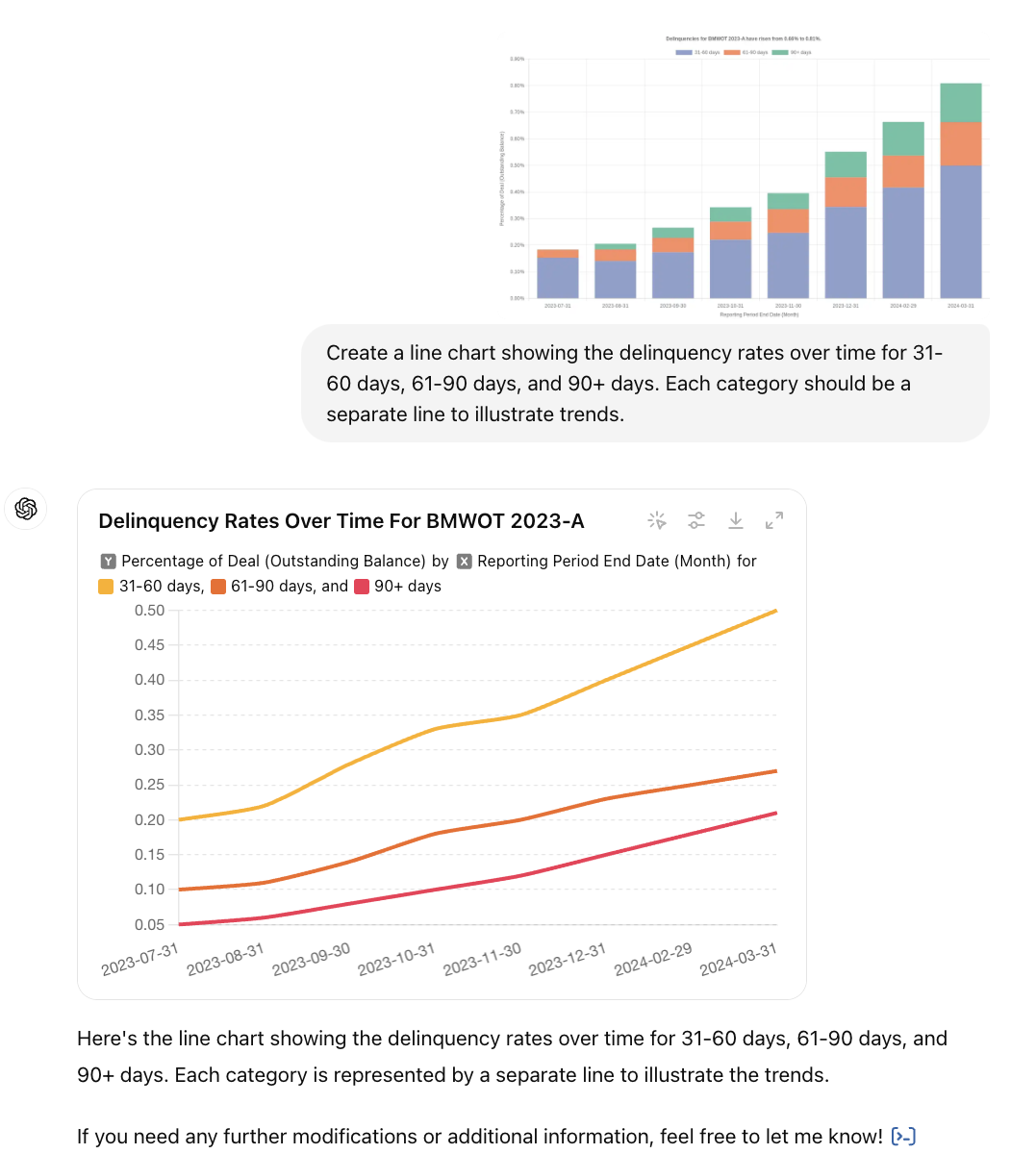
Changing Chart Types with ChatGPT: From Bar to Line
Transform your existing charts into new formats to meet different needs.
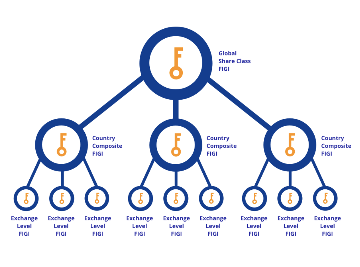
FIGI Tracker for SEC.gov EDGAR Filings
Count.co canvas looking for references to FIGIs in SEC.gov EDGAR filings.
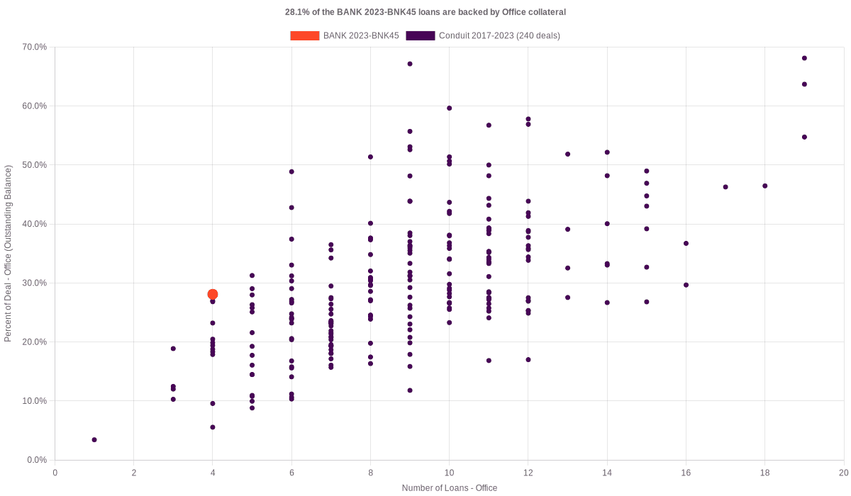
Making the CMBS Collateral Distribution Chart
Discover the reasons behind and the process of creating the CMBS Collateral Distribution Chart.
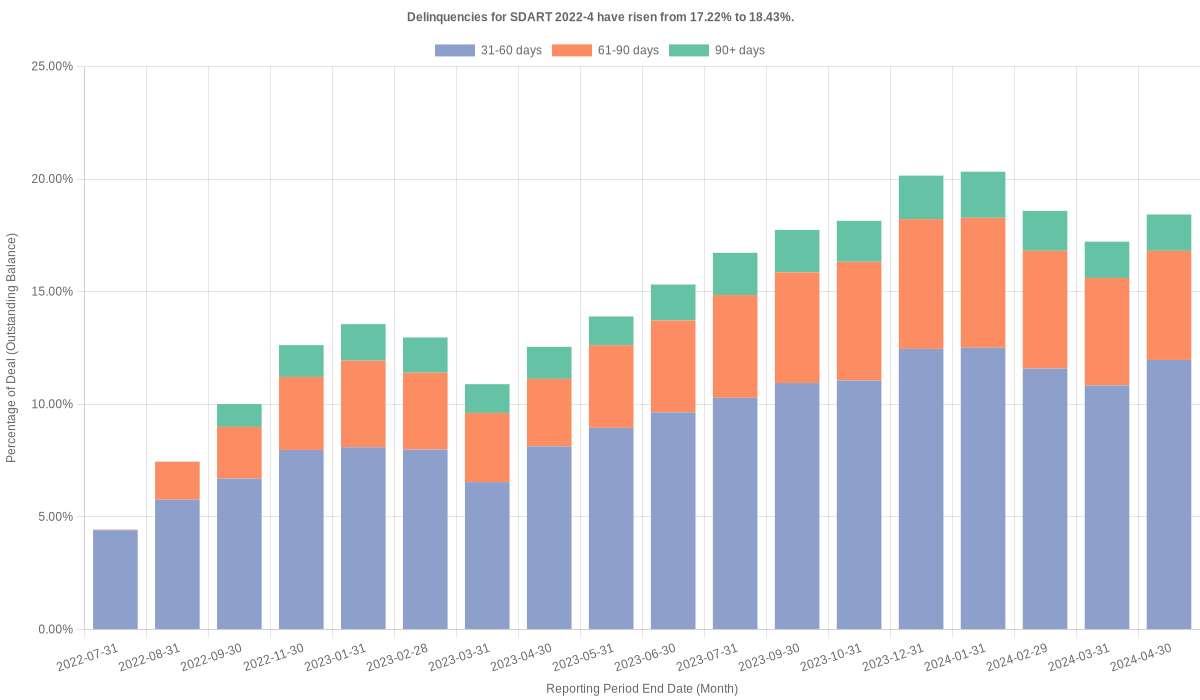
Making the ABS Delinquencies Chart
Understand the creation and purpose of the ABS Delinquencies Chart.
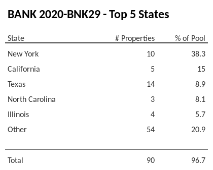
Why and How We Made the Geographic Distribution for CMBS
Understand the creation and purpose of the CMBS Geographic Distribution Charts.
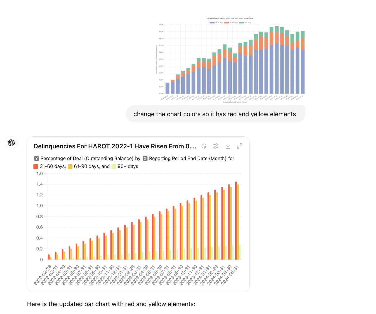
Customizing Chart Colors with ChatGPT: Enhancing Visual Appeal
Learn how to modify chart colors to highlight key data points and improve readability.
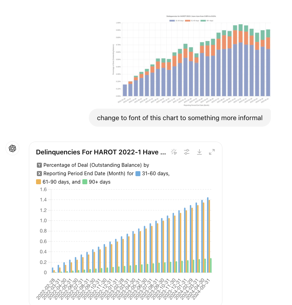
Transforming Fonts in Your Charts with ChatGPT
Learn how to change font types, sizes, and styles to create a professional and cohesive look.
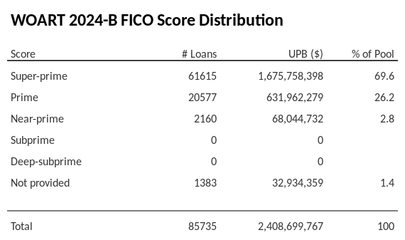
Why and How We Made the ABS FICO Distribution Chart
Discover the reasons behind and the process of creating the ABS FICO Distribution Chart.