Why and How We Made the CMBS Collateral Distribution Chart
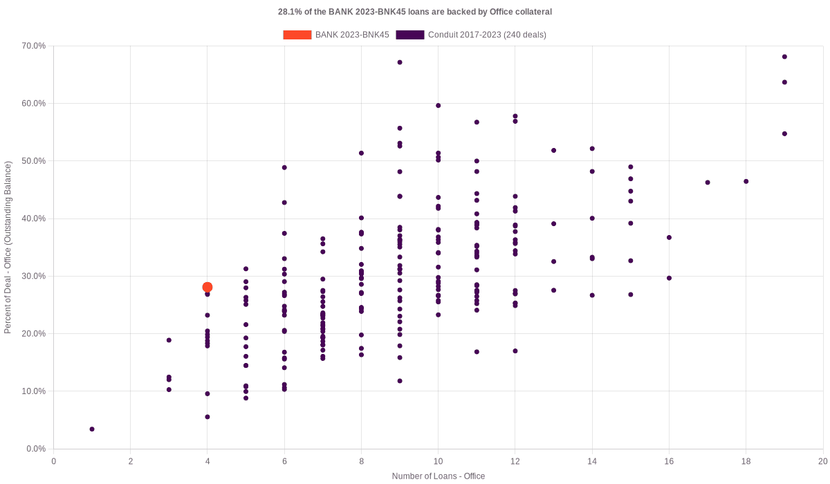
Explore the CMBS collateral distribution chart to understand the distribution of multifamily collateral in CMBS deals. See how we use a metadata-first approach to compare collateral levels across deals and provide actionable insights for investment and risk assessment.
How We Made This Chart
Our CMBS collateral distribution chart is designed to help you understand the distribution of multifamily collateral within Commercial Mortgage Backed Securities (CMBS) deals. Here’s a detailed look at how we created this chart using our metadata-first data strategy:
Collecting Metadata
We started by collecting metadata from the Reg AB II Asset-level Requirements, specifically focusing on the CREFC Property Type code and the Reporting Period End Actual Balance Amount from Form ABS-EE for this deal.
This involved gathering data schemas and identifying key data points related to property types and their corresponding balances.
Curating Metadata
After collecting the raw metadata, we curated it to focus on the most relevant information for visualizing collateral distribution. This involved filtering the data to include only the necessary elements for an accurate representation of property types and their outstanding balances.
The data was organized to highlight the percentage of deals backed by multifamily collateral, allowing us to identify trends and patterns in the CMBS market.
Operationalizing Metadata
Using our advanced data pipelines, we transformed the curated metadata into a visual format. This involved automating the process to generate charts that clearly represent the distribution of property types across multiple CMBS deals.
We utilized data visualization tools to create a scatter plot that displays the percentage of deals backed by multifamily collateral against the number of multifamily loans. This format helps users quickly grasp the distribution and significance of different property types within CMBS deals. If you want to visualize collateral distribution by other metrics such as the most recent valuation or property size, feel free to email us. You can also explore all available CMBS deals with this chart.
Why This Chart Is Valuable
The CMBS collateral distribution chart allows you to compare the amount of multifamily collateral within a particular deal’s collateral pool against all other deals in the CMBS dataset. This helps answer questions like, "Does deal A have more collateral than most CMBS deals?" By providing this comparative insight, the chart can be particularly useful for:
-
Investment Decision-Making: Quickly assess whether a specific CMBS deal has a higher or lower proportion of multifamily collateral compared to the market norm.
-
Portfolio Management: Evaluate how the collateral composition of individual deals fits within the broader context of your investment portfolio.
-
Risk Assessment: Identify deals with unusually high or low levels of multifamily collateral, which may indicate higher risk or unique investment opportunities.
-
Market Analysis: Understand broader trends in the CMBS market regarding collateral types and their distribution across deals.
Real-World Applications
To illustrate the practical applications of this chart, consider the following scenarios:
-
Investment Analysis: An investment manager uses the chart to compare the multifamily collateral of a potential new deal against existing CMBS deals in the market, aiding in investment decisions.
-
Regulatory Compliance: A compliance officer examines the chart to ensure that the distribution of multifamily collateral in the bank’s CMBS deals aligns with regulatory expectations and industry standards.
-
Market Research: A research analyst includes the collateral distribution chart in a market report, providing clients with insights into the prevalence and distribution of multifamily collateral in CMBS deals.
By following a metadata-first data strategy—collecting, curating, and operationalizing metadata—we can efficiently produce valuable insights and visualizations. This approach allows us to autogenerate detailed collateral distribution charts, saving you time and providing reliable verification.
We hope this chart saves you time, inspires new insights, and provides reliable verification.