Yield Curve Flattening Guide
Yield Curve Flattening: From Macro Signal to Portfolio Impact
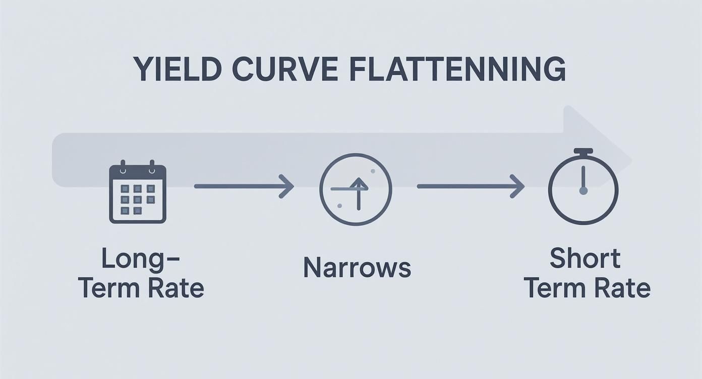
When the spread between long-term and short-term interest rates compresses, it's known as yield curve flattening. For structured-finance analysts, data engineers, and quants, this is more than an economic footnote; it's a critical signal with direct implications for asset-backed security (ABS) pricing, commercial mortgage-backed securities (CMBS) risk, and prepayment modeling. Understanding its drivers and data lineage is crucial for any programmatic analysis of credit markets.
This shift in the cost of capital over time directly influences investor behavior, recalibrates prepayment assumptions, and can force a complete overhaul of portfolio strategy. Being able to trace this macro signal down to individual securities is essential, and tools like Dealcharts provide the context to visualize and cite these connections from verifiable sources.
How a Flattening Yield Curve Impacts Credit Markets
The yield curve plots the yields of bonds with similar credit quality but different maturity dates. A normal, upward-sloping curve compensates investors for the risks of holding debt longer. When this slope compresses, the market is signaling a fundamental change in its expectations for future growth, inflation, and monetary policy. This dynamic, yield curve flattening, is a primary indicator for anyone modeling CMBS or ABS deals.
For analysts, a flattening curve is not an abstract concept. It has direct, measurable consequences that demand attention. The key is to understand the data lineage: where did the signal originate, and how does it propagate through the capital structure of a specific deal?
Why It Matters to Analysts
To model its impact accurately, you must identify the driver behind the flattening:
- Central Bank Tightening: When a central bank raises short-term rates to combat inflation, it pushes the front end of the curve up.
- Economic Growth Concerns: If investors anticipate a slowdown or recession, they buy long-term bonds as a safe haven, driving their yields down.
- Lower Inflation Expectations: If the market believes long-term inflation is contained, investors demand a smaller premium for holding longer-dated debt, causing long-term yields to fall.
This pattern is a reliable precursor to economic shifts. For instance, between December 2016 and early 2019, the 10-year/2-year U.S. Treasury spread collapsed from 134 basis points to just 25 basis points, a classic flattening cycle detailed in market analyses like this full analysis of that trend on morganstanley.com.
For structured finance, these signals are direct model inputs. A flattening curve alters prepayment speeds for mortgage-backed securities as refinancing incentives diminish. It also reshuffles the relative value of tranches within a collateralized loan obligation (CLO). Access to clean, verifiable data is non-negotiable for contextualizing these shifts and quantifying their impact on specific securities.
The Data & Technical Angle: Sourcing and Interpreting the Curve
A flattening yield curve is a process, not a singular event. To model it, an analyst must differentiate between its two primary forms: the bull flattener and the bear flattener. Each tells a different story about the economy's trajectory, and this distinction is the first critical step in any rigorous analysis. It frames your market view and determines whether you are bracing for an economic slowdown or reacting to central bank policy.
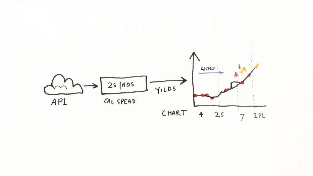
The core concept is simple: the compensation for holding debt over a longer period shrinks. Data for this analysis originates from primary sources like the U.S. Treasury, which publishes daily yield curve rates. Analysts access this data via APIs, parse it, and calculate key spreads (e.g., 10-year minus 2-year yield) to quantify the curve's shape.
Bull Flattener: A Signal of Economic Pessimism
A bull flattener occurs when long-term rates fall faster than short-term rates. This is a classic flight-to-safety move. When investors grow concerned about an economic slowdown or recession, they purchase long-term Treasury bonds, pushing prices up and yields down.
- Context: Typically observed during periods of slowing GDP growth, weakening corporate earnings, or geopolitical instability.
- Driver: Market pessimism. Investors prioritize capital preservation over yield.
- Implication: A strong signal that the economic fundamentals underpinning collateral performance—from commercial rent payments to auto loan amortization—are weakening.
A bull flattener is the market's vote of no confidence in future growth. It signals that investors are prioritizing capital preservation over yield, a crucial insight for anyone modeling credit risk in long-duration assets like CMBS.
Bear Flattener: A Reaction to Monetary Tightening
Conversely, a bear flattener happens when short-term rates rise faster than long-term rates. This is the hallmark of a central bank tightening cycle. As the Federal Reserve hikes its policy rate to combat inflation, short-term yields (like the 2-year Treasury) rise accordingly. Long-term yields also tend to rise but are tempered by the market's belief that the central bank's actions will eventually stabilize the economy and control inflation. This dynamic requires a firm grasp of the concept of a risk-free rate.
- Context: Occurs during economic expansions when inflation becomes a primary concern.
- Driver: Hawkish central bank policy is the primary catalyst.
- Implication: A direct impact on floating-rate instruments and the cost of short-term funding.
For an analyst, distinguishing between a bull and bear flattener is essential. It is the difference between a market-driven fear signal and a policy-driven mechanical shift, each with distinct implications for asset valuation and risk management.
Example Workflow: Programmatically Tracking the Curve
To move beyond passive observation, analysts must build systematic workflows to track the yield curve. A programmatic approach ensures reproducibility and allows these macro signals to be piped directly into risk models. This workflow demonstrates a clear data lineage: sourcing raw data from verifiable endpoints, transforming it into a meaningful metric, and generating an insight.
The process starts with sourcing reliable data. Daily Treasury yield curve rates are available from public sources like the U.S. Department of the Treasury's API or financial data providers. This data is the raw input for calculating spreads like the classic 2s/10s (10-year yield minus 2-year yield).
Python Snippet: Fetching and Plotting the 2s/10s Spread
This Python example uses the
library to fetch Treasury yield data and calculate the 2s/10s spread, demonstrating a simple yet powerful workflow.yfinance
# Import necessary librariesimport pandas as pdimport yfinance as yfimport matplotlib.pyplot as plt# Explainability: Define tickers for 10-Year and 2-Year Treasury yields# Data Source: Yahoo Finance provides proxy tickers for these rates.tickers = {'2Y': '^IRX', # Note: Proxy for short-term rate. A dedicated API is better for precision.'10Y': '^TNX' # 10-Year Treasury Note Yield CBOE Index}# Define the time period for analysisstart_date = '2020-01-01'end_date = '2023-12-31'# Transformation Step 1: Fetch historical data from the source# The yf.download() function retrieves daily price data. We use 'Adj Close' for yield.data = yf.download(list(tickers.values()), start=start_date, end=end_date)['Adj Close']data = data.rename(columns={v: k for k, v in tickers.items()}) # Rename for clarity# Transformation Step 2: Calculate the 2s/10s spread in basis points# The spread is a derived metric representing the slope of the yield curve.if '10Y' in data.columns and '2Y' in data.columns:# Calculation: (10Y Yield - 2Y Yield) * 100 to convert to basis pointsdata['2s10s_spread_bps'] = (data['10Y'] - data['2Y']) * 100else:print("Required yield data not available. Check ticker validity.")exit()# Insight: Visualize the calculated spread over timeplt.figure(figsize=(12, 6))plt.plot(data.index, data['2s10s_spread_bps'], label='2s/10s Spread (bps)')plt.title('Historical 2s/10s Treasury Spread (Data Lineage: Yahoo Finance -> Python -> Matplotlib)')plt.ylabel('Spread (Basis Points)')# Add a zero line to clearly indicate curve inversionplt.axhline(0, color='red', linestyle='--', linewidth=0.8, label='Inversion Level (0 bps)')plt.legend()plt.grid(True)plt.show()# The final output is a reproducible chart showing the yield curve's historical slope.
This script establishes a clear data lineage:
. This programmatic approach turns a qualitative market observation into a quantitative input for more advanced models.Source (Yahoo Finance) → Transform (Pandas calculation) → Insight (Matplotlib visualization)
Implications for Modeling and Risk Monitoring
The true analytical value is realized when macro signals like the yield curve spread are integrated into deal-level models. This creates a "model-in-context," where verifiable market data sharpens the accuracy and, crucially, the explainability of portfolio risk assessments. Instead of relying on static assumptions, models become dynamic and responsive to the prevailing economic environment.
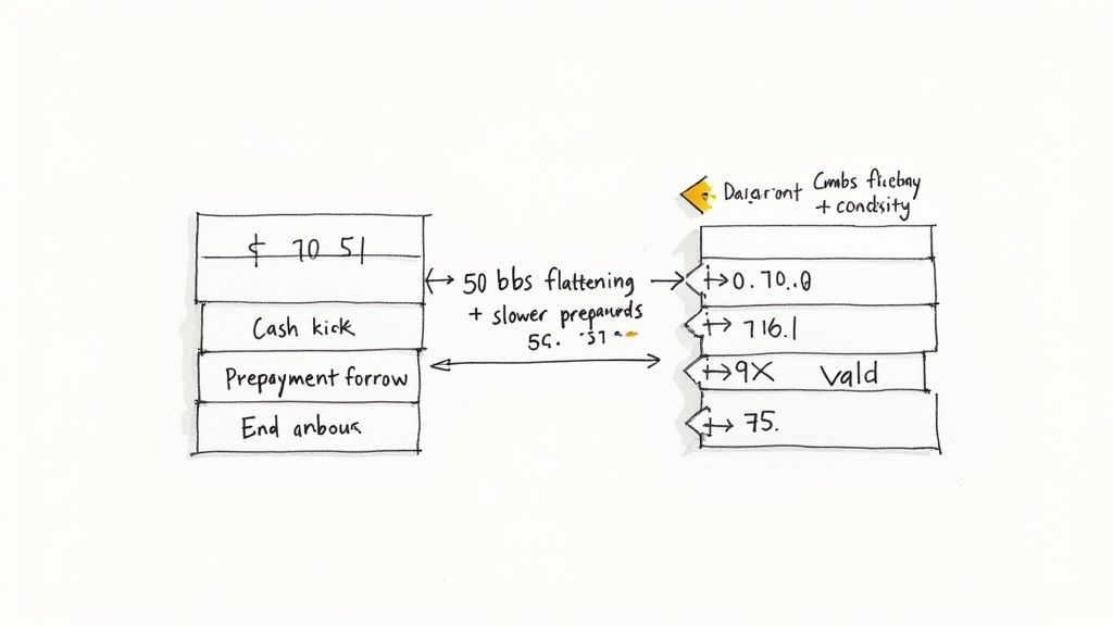
A flattening curve directly impacts prepayment, credit, and valuation models for structured products. For instance, in an MBS prepayment model, the 2s/10s spread can be used as a feature to predict Conditional Prepayment Rates (CPR). A lower spread signals reduced refinancing incentives, automatically lowering the CPR forecast. This is how an explainable pipeline works: a change in a macro indicator can be traced directly to an adjusted risk forecast for a specific tranche of a deal like the BMARK 2025-V14 transaction.
This same logic applies to credit risk. Since curve flattening often precedes economic downturns, a rapidly compressing spread can trigger higher probability of default (PD) or loss given default (LGD) assumptions for economically sensitive collateral, such as CMBS backed by office or retail properties. Integrating these signals improves risk monitoring, moving it from a reactive to a proactive discipline.
How Dealcharts Helps
Connecting macro indicators like yield curve dynamics to the granular performance of specific CUSIPs is analytically intensive. It requires linking market data to deal-level remittance reports, servicer filings, and loan tapes—a process fraught with data lineage challenges. Manually tracing the impact of a flattening curve across a portfolio is inefficient and prone to error.
Dealcharts solves this by creating a connected knowledge graph for structured finance. It integrates disparate datasets—filings, deals, shelves, tranches, and counterparties—into a coherent, navigable structure. This eliminates the undifferentiated heavy lifting of data integration, allowing analysts to move directly from a market signal to its deal-level consequences. Instead of building data pipelines, analysts can focus on generating and sharing verified, reproducible insights.
Conclusion
Understanding yield curve flattening requires more than just acknowledging a chart's changing shape. For professionals in structured finance and data science, it demands a rigorous, data-driven approach that connects macro signals to portfolio risk. By building explainable pipelines with clear data lineage, analysts can transform this key economic indicator from a passive observation into an active input for more intelligent, context-aware risk models. This approach, central to the CMD+RVL framework, ensures that financial analytics are not only powerful but also reproducible and defensible.
Article created using Outrank