Structured-Finance API for Charts
How to Use a Structured-Finance API for Charts to Visualize Verifiable ABS Data
Turning siloed structured finance data into clear, verifiable visuals is a persistent challenge for analysts and quants. A structured-finance API for charts offers the solution: programmatic access to link, query, and transform messy datasets from public filings into publication-ready visuals. Critically, it provides a clear, auditable data lineage from the source document to the final insight, a non-negotiable for any serious risk monitoring or investor reporting. This guide moves beyond surface-level explanations to demonstrate how programmatic access to a connected data graph—linking filings, deals, tranches, and counterparties—makes analysis both reproducible and trustworthy. You can visualize this data on platforms like Dealcharts to cite your findings.
The Market Context: Why Verifiable Data Lineage is No Longer Optional
The structured finance market is expanding rapidly, but this growth comes with a significant operational challenge: regulators and clients now demand verifiable data lineage for every analytical output. Every number on a chart must be traceable back to its source, whether a 10-D remittance report on EDGAR or a 424B5 prospectus.
This isn't a minor issue; it's a workflow bottleneck. Analysts, quants, and data engineers spend countless hours on low-value, high-risk tasks like manually parsing inconsistent remittance reports or linking scattered public filings. This manual grind is not just slow; it introduces significant operational risk. According to Technavio, the market is projected to grow by over a trillion dollars by 2029. Manual workflows cannot scale to meet this data explosion.
The core problem is the disconnected nature of the data. Critical information for surveillance—deal performance, collateral details, counterparty risk—is fragmented across thousands of documents with no standardized format. Programmatic access via an API is no longer a luxury; it's a baseline requirement for any firm focused on speed, accuracy, and compliance.
The Technical Angle: Accessing a Connected Structured Finance Data Graph
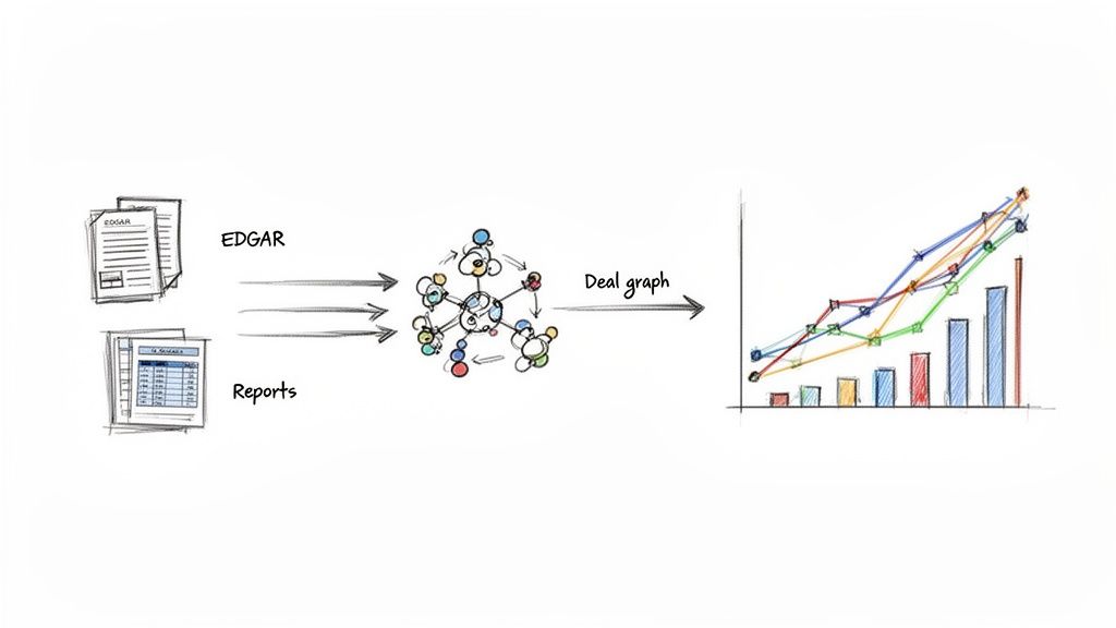
The foundational data for structured finance analysis originates from public filings with the SEC, primarily from the EDGAR system. Key documents include:
- 424B5 Prospectuses: Contain the initial capital structure, collateral details, and deal terms at issuance.
- 10-D Remittance Reports: Provide monthly or quarterly performance updates, including delinquencies, prepayments, and cash flow distributions.
- 8-K Filings: Announce material events related to a deal or its underlying assets.
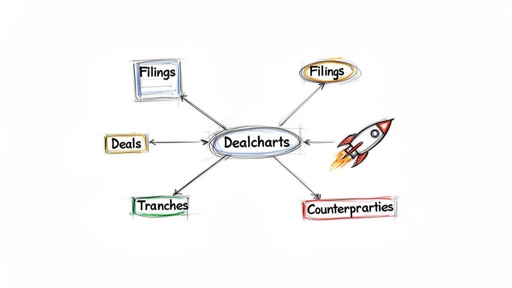
Without an API, analysts must manually download, parse, and link these documents—a fragile and time-consuming process. A specialized structured-finance API for charts, like the one from Dealcharts, solves this by ingesting these raw documents and organizing them into a connected data graph. This pre-linked graph connects entities—filings, deals, tranches, shelves, and counterparties—allowing developers to query relationships directly rather than just fetching isolated data points. Instead of parsing PDFs, you can make a clean API call to retrieve structured JSON that is immediately ready for analysis or visualization.
Example Workflow: Programmatic Charting from an API Call
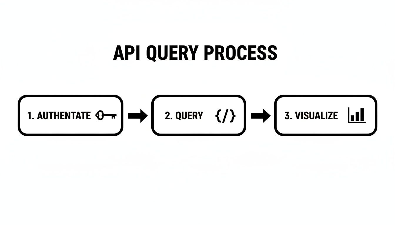
This workflow demonstrates the core principle of explainability: tracing data from its source (API call) through transformation (code) to the final insight (chart). We'll use a Python snippet to visualize a CMBS capital structure, a common task for credit analysts.
First, an analyst would query an API endpoint to retrieve tranche data for a specific deal. For instance, a
request to an endpoint likeGET
would return a structured JSON response./v1/deals/MSWF2023-1/tranches
Data Lineage: Source → Transform → Insight
- Source: JSON response from the Dealcharts API for the MSWF 2023-1 CMBS deal.
- Transform: A Python script using
andpandas
to parse the JSON and generate a horizontal bar chart.matplotlib - Insight: A clear visualization of the deal’s credit enhancement levels, ready for an investment memo.
Here is a reproducible code snippet showing this transformation:
import matplotlib.pyplot as pltimport pandas as pd# Assume this is the JSON data from the API calltranche_data = [{"class": "A-1", "original_balance": 150000000, "credit_enhancement": 30.0},{"class": "A-2", "original_balance": 200000000, "credit_enhancement": 30.0},{"class": "B", "original_balance": 50000000, "credit_enhancement": 20.0},{"class": "C", "original_balance": 35000000, "credit_enhancement": 15.0},{"class": "D", "original_balance": 25000000, "credit_enhancement": 10.0},{"class": "NR", "original_balance": 40000000, "credit_enhancement": 0.0}]# 1. Transform the raw JSON into a Pandas DataFrame for easier manipulationdf = pd.DataFrame(tranche_data)df_sorted = df.sort_values(by='credit_enhancement', ascending=True)# 2. Create the plotfig, ax = plt.subplots(figsize=(10, 6))bars = ax.barh(df_sorted['class'], df_sorted['original_balance'], color='#0047AB')# 3. Style the chart for professional presentationax.set_title('Capital Structure Waterfall for MSWF 2023-1', fontsize=16)ax.set_xlabel('Original Balance (in $100M)', fontsize=12)ax.set_ylabel('Tranche Class', fontsize=12)ax.xaxis.set_major_formatter(lambda x, pos: f'${x/1e8:.1f}')ax.grid(axis='x', linestyle='--', alpha=0.6)# 4. Add a data lineage citation in the footerplt.figtext(0.1, 0.01, 'Source: Dealcharts API, data for deal MSWF 2023-1',ha="left", fontsize=8, color='gray')plt.tight_layout()plt.show()
The script itself becomes part of the audit trail, creating a repeatable recipe that links the raw API data to the final chart. This programmatic approach ensures consistency and eliminates the risk of manual errors.
Implications: Building Explainable Pipelines and Context Engines
This workflow fundamentally improves analysis by embedding it within an explainable pipeline. When every chart can be programmatically regenerated and traced back to a specific filing, it becomes a verifiable asset rather than a static image. This aligns with the "model-in-context" framework, where analytical outputs are bundled with their underlying data and logic.
The implications for structured finance workflows are significant:
- Improved Risk Monitoring: Automated scripts can pull key performance indicators (KPIs) from the latest 10-D filings to power real-time surveillance dashboards, flagging covenant breaches or performance deviations instantly.
- Enhanced Modeling: The same verified data used for visualization can be piped directly into predictive models, ensuring consistency between exploratory analysis and quantitative modeling.
- Fueling Context-Aware LLMs: A connected data graph provides the structured context necessary for Large Language Models (LLMs) to reason about credit risk. An LLM can be prompted to "summarize risk factors for all deals from the JPMorgan organize their shelves shelf, citing prospectus language," a task impossible with siloed data.
Ultimately, a structured-finance API for charts is more than a data feed; it's the plumbing for a context engine that makes financial analytics more transparent, reproducible, and trustworthy.
How Dealcharts Accelerates This Workflow
Dealcharts connects these disparate datasets—filings, deals, shelves, tranches, and counterparties—so analysts can publish and share verified charts without rebuilding data pipelines. By abstracting away the complexities of data sourcing and linkage, the API allows teams to move directly from a query to a publication-ready visual with a fully auditable trail back to the source filing. This drastically reduces the research-to-report lifecycle, freeing analysts to focus on insight, not infrastructure.
Conclusion
A structured-finance API for charts is an essential component of the modern analytical toolkit. By providing programmatic access to a connected graph of verifiable data, it enables the creation of explainable data pipelines that enhance the speed, accuracy, and defensibility of financial analysis. This approach moves beyond simple data retrieval, creating a foundation for reproducible insights and more sophisticated, context-aware models. This framework for reproducible finance is a core principle behind the CMD+RVL ecosystem.
A Few Common Questions
When you start pulling structured finance data programmatically, a few questions always seem to pop up. Here are the ones I hear most often.
What's the Right Chart for the Job?
The type of chart you pick really depends on the story you're trying to tell with the data. You have to match the visual to your goal.
From my experience, a few types stand out:
- Waterfall Charts: These are my go-to for showing a deal's capital structure. They make it immediately obvious how credit tranching works and how subordination protects the senior notes from losses. It’s the clearest way to visualize the flow of payments and losses.
- Time-Series Charts: Absolutely essential for tracking performance over the life of a deal. Think delinquencies, prepayments, or cumulative losses. Plotting these metrics over time is how you spot trends and flag potential problems in the collateral pool before they get out of hand.
- Bar Charts: Nothing beats a simple bar chart for straightforward comparisons. You can easily benchmark a handful of deals from the same vintage by yield, WAL (Weighted Average Life), or credit enhancement. It's a quick, effective way to see how things stack up.
How Can I Prove My Chart's Data Is Legit?
This is a big one. Trust is everything, and that means your analysis has to be defensible. Verifiability is non-negotiable.
The only real answer is to use a structured-finance API for charts that bakes in data lineage. You need to be able to trace every single data point on your chart back to its origin—a specific public filing, like a 10-D remittance report or a 424B5 prospectus.
A best practice I always follow is to include a source citation directly in the chart's footer. It should reference the deal and the API you used to get the data. That level of transparency is what makes your work bulletproof when it lands in front of management or clients.
Can I Plug This into Tools like Tableau or Power BI?
Yes, and this is a common workflow for teams that want to build out dynamic dashboards for surveillance or internal reporting.
Most modern APIs built on a REST architecture will hand you the data in a standard JSON format. Tools like Tableau, Power BI, or Looker are designed to work with this. You just use their built-in web data connectors to call the API directly.
The BI tool handles parsing the JSON response, which means you can start building your visualizations without having to write a ton of code. It's a powerful way to automate reporting and keep a near-real-time pulse on deal performance across your portfolio.
Article created using Outrank