Python CMBS Surveillance Dashboard
Building a Python CMBS Surveillance Dashboard: From Data Pipeline to Predictive Insights
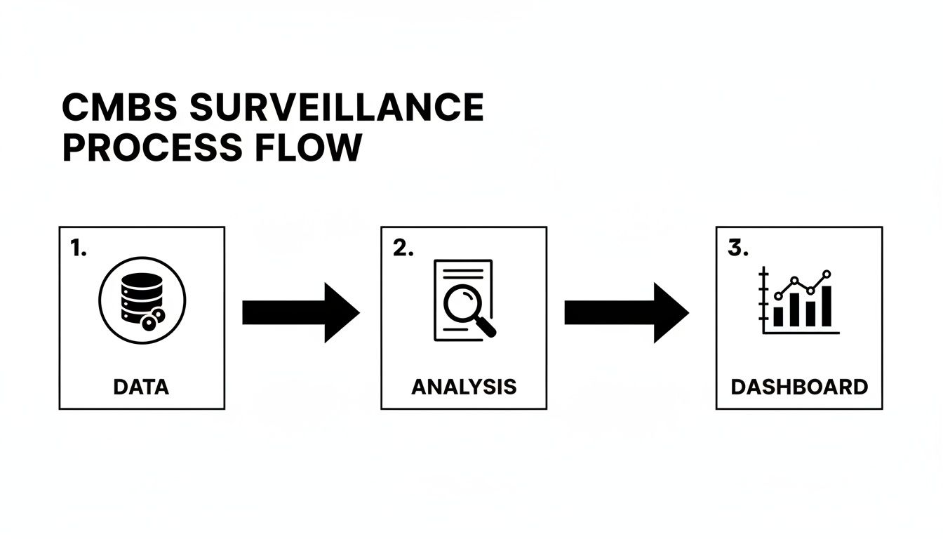
In structured finance, a Python CMBS surveillance dashboard is an essential tool for transforming raw remittance data into actionable risk intelligence. Moving beyond static spreadsheets, a programmatic dashboard allows analysts to monitor collateral performance, delinquency trends, and loan-level triggers in real time. This guide outlines a practical workflow for building a robust surveillance platform, covering data ingestion, metric calculation, and visualization using verifiable data from sources like EDGAR 10-D filings. A well-architected dashboard provides a clear, reproducible data lineage, enabling analysts to trace every insight back to its source. The data and charts within can be explored and cited using platforms like Dealcharts.
Market Context: Navigating CMBS Volatility
Monitoring Commercial Mortgage-Backed Securities (CMBS) requires a deep understanding of underlying credit risks, especially in today's volatile market. Analysts face significant challenges, from tracking loan-level performance across thousands of assets to modeling the impact of interest rate shifts and property sector downturns. With a looming $150.9 billion maturity wall in 2025, the ability to programmatically monitor refinancing risk is no longer a luxury—it is a necessity. A report from Trepp notes that office loans comprise 23% of this total, a sector already under immense pressure. More context on these maturity wall challenges from Private Debt Investor highlights the practical need for dynamic surveillance tools that can identify and quantify risk before it crystallizes into losses.
Data & Technical Angle: Sourcing and Structuring CMBS Data
An effective Python CMBS surveillance dashboard is built on a foundation of clean, reliable data. The primary source for this information is investor reporting packages, including monthly remittance reports often filed as exhibits to Form 10-D with the SEC. These documents contain loan-level tapes detailing performance metrics like principal balance, delinquency status, and DSCR.
Accessing this data programmatically involves:
- Fetching Data: Using APIs or web scrapers to retrieve 10-D filings and their associated exhibits from EDGAR.
- Parsing: Extracting loan-level data from various formats (XML, CSV, or even proprietary text files).
- Structuring and Linking: Normalizing the parsed data and loading it into a relational database. This involves linking loans to their respective deals (identified by a CIK), tranches (identified by a CUSIP), and properties.
The Dealcharts dataset provides pre-parsed and linked data from public filings, allowing developers to bypass the complex ETL process and access structured information via an API. For example, analysts can retrieve all deals within a specific vintage, like the CMBS 2024 vintage data on Dealcharts, without building a custom parser.
Example Workflow: A Python Ingestion Snippet
To ensure data integrity, a verifiable ingestion pipeline is crucial. The following Python snippet demonstrates a conceptual workflow using Pandas for data handling, Pydantic for validation, and SQLAlchemy for database interaction. This approach creates an explainable data lineage: from a raw source (a parsed 10-D file) through transformation and validation to a structured database record.
import pandas as pdfrom pydantic import BaseModel, ValidationErrorfrom sqlalchemy import create_engine# 1. Define a Pydantic model for data validation (Source -> Transform)class LoanRemittance(BaseModel):loan_id: strdeal_name: strreporting_period: pd.Timestampcurrent_balance: floatdscr: float | None = Nonedelinquency_status: int# Assume 'raw_df' is a pandas DataFrame parsed from a 10-D remittance fileraw_df = pd.DataFrame({'loan_id': ['LN001', 'LN002'],'deal_name': ['BMARK 2024-V5', 'BMARK 2024-V5'],'reporting_period': ['2024-10-25', '2024-10-25'],'current_balance': [5000000.0, 'INVALID'], # Intentionally bad data'dscr': [1.25, 1.05],'delinquency_status': [0, 30]})# 2. Ingestion and Validation Workflow (Transform -> Insight)validated_records = []for index, row in raw_df.iterrows():try:# Attempt to create and validate a recordrecord = LoanRemittance(**row.to_dict())validated_records.append(record.dict())except ValidationError as e:# Catch and log validation errors, ensuring bad data is rejectedprint(f"Validation error for loan {row.get('loan_id')}: {e}")# Convert validated records back to a DataFrameclean_df = pd.DataFrame(validated_records)# 3. Load validated data into a database# engine = create_engine('postgresql://user:password@host/dbname')# clean_df.to_sql('remittance_data', engine, if_exists='append', index=False)print("Cleaned DataFrame ready for database insertion:")print(clean_df)
This snippet shows how Pydantic enforces data types, catching the 'INVALID'
before it contaminates the database. This ensures every number on the final dashboard is traceable and valid.current_balance
Insights and Implications: Building a Context Engine
A programmatic approach does more than automate reporting; it creates a structured context engine for risk analysis. By linking deals, loans, properties, and time-series performance data, analysts can move beyond simple metrics. This linked data structure enables "model-in-context" analysis, where a model's output (e.g., a default probability) is accompanied by its full data lineage—the specific filing, property details, and performance history that produced the result. This explainability is critical for validating models, satisfying regulatory requirements, and building trust with stakeholders. It transforms a dashboard from a black box into an auditable, transparent analytical tool, aligning perfectly with CMD+RVL's philosophy of creating reproducible, context-aware financial models.
How Dealcharts Helps
Dealcharts connects these disparate datasets—filings, deals, shelves, tranches, and counterparties—so analysts can publish and share verified charts without rebuilding data pipelines from scratch. By providing a clean, linkable context graph of the structured finance market via an API, Dealcharts allows developers and data scientists to focus immediately on building high-value analytics, such as a Python CMBS surveillance dashboard, rather than spending months on data plumbing.
Conclusion
Building a Python-based CMBS surveillance dashboard provides a scalable, reproducible, and transparent solution for modern credit risk management. By focusing on a verifiable data lineage from source filings to final insight, analysts can create powerful tools that not only monitor current performance but also provide the structured context needed for more advanced, explainable modeling. Frameworks like CMD+RVL promote this vision of reproducible finance, where every analytical outcome is auditable and trustworthy.
Essential Metrics for Your Python CMBS Dashboard
To build an effective dashboard, you need to track the right vitals. The table below outlines the core metrics that should form the backbone of your surveillance efforts. Think of these as the absolute must-haves for understanding portfolio health and identifying emerging risks.
| Surveillance Metric | What It Reveals About Risk | Recommended Python Libraries |
|---|---|---|
| Delinquency Rates (30/60/90+) | The most direct indicator of borrower stress and potential defaults. | for grouping, for time-series charts |
| Debt Service Coverage Ratio (DSCR) | Measures a property's ability to cover its debt payments; declining DSCR is an early warning sign. | or for calculation |
| Loan-to-Value (LTV) Ratio | Shows the loan's leverage against the property's value; high LTV indicates higher risk on default. | or for calculation |
| Watchlist & Special Servicing Status | Flags loans that servicers have identified as high-risk or have already transferred for workout. | for filtering, or for tables |
| Geographic Concentration | Exposes vulnerability to regional economic downturns or natural disasters. | for analysis, or for maps |
| Property Type Concentration | Highlights overexposure to struggling sectors (e.g., office, retail). | for grouping, for pie/bar charts |
| Tenant Rollover/Occupancy Rates | Indicates the stability of cash flow, especially for single-tenant or major-tenant properties. | for time-series analysis |
| Maturity/Refinancing Risk | Identifies loans approaching their maturity date that may struggle to refinance in the current rate environment. | for filtering by date, for histograms |
Tracking these metrics isn't just about populating a dashboard; it's about building a narrative around your portfolio's risk profile. Each number tells a piece of the story, and your job is to put them together to see the full picture. Python provides the tools to not only calculate these figures but to visualize their trends and interconnections effectively.
Calculating and Visualizing Key Surveillance Metrics
Once your data pipeline is reliably feeding your database, the analytical work begins. This phase transforms structured, validated data into the critical metrics that drive CMBS risk assessment. The goal is to build a narrative around the portfolio's health, surfacing trends and distributions that a static report could never reveal.
This process involves two stages: programmatically calculating metrics using Python and visualizing them in an interactive format that empowers analysts. We aim to build components that let users spot outliers, drill down into underlying assets, and understand the drivers of performance shifts.
Deriving Core Performance Indicators
The foundation of any good Python CMBS surveillance dashboard is a solid set of core metrics. These are the indicators that give you a multi-faceted view of credit risk, cash flow stability, and leverage.
Your Python scripts will do the heavy lifting: querying the database, pulling the necessary loan and remittance data into Pandas DataFrames, and then running the calculations.
Here are the essentials and how I'd approach them:
- Delinquency Rates: The most direct measure of credit stress. Calculate the percentage of the pool's balance that's 30, 60, and 90+ days delinquent, plus any loans in foreclosure or REO. A simple Pandas operation—grouping by
and summing thedelinquency_status
—gets you there.current_balance - Weighted Average Coupon (WAC): This gives you a quick read on the gross yield of the loan pool. It's calculated by weighting each loan's interest rate against its current principal balance.
- Loan-to-Value (LTV) Ratios: A classic indicator of leverage and potential loss severity. You can calculate this at origination using
and keep it current if you have updated valuations.original_appraised_value - Debt Service Coverage Ratio (DSCR): This measures a property's ability to cover its debt payments with its net operating income. A DSCR dipping below 1.0x is a major red flag.
These metrics become powerful when sliced by deal, vintage, property type, or geographic region. Comparing the DSCR of office properties in a 2024 deal like the BMARK 2024-V5 issuance against retail properties from a 2018 vintage can quickly expose sector-specific stress.
Building Interactive Visualizations with Plotly and Dash
Raw numbers in a table are fine, but interactive charts tell a story. This is where tools like Dash and Plotly come in, letting you build a web-based interface where users can explore the data for themselves. The key is to design components that answer specific analytical questions.
The most effective visualizations aren't just displays of data; they are interactive canvases for hypothesis testing. An analyst should be able to ask, "What happens to the portfolio's delinquency rate if I only look at loans in Texas?" and get an answer instantly.
Consider building out these specific components for your dashboard:
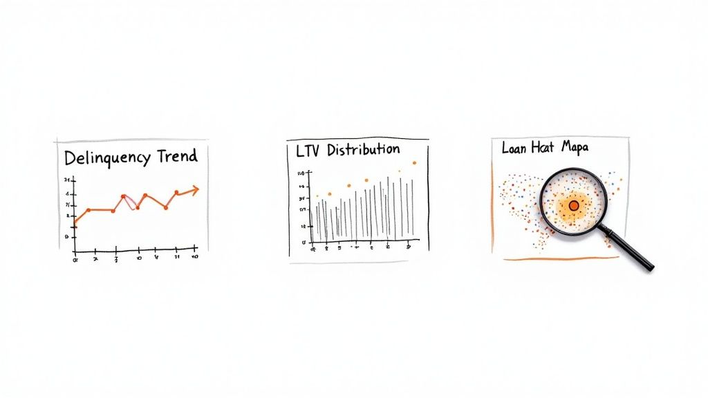
- Delinquency Trend Lines: A time-series line chart showing historical delinquency buckets (30, 60, 90+ days) for a specific deal or the whole portfolio. This tells you immediately if credit risk is getting better or worse.
- LTV Distribution Histograms: A histogram visualizing the spread of LTVs across the pool. This is great for spotting concentrations of high-leverage loans that a simple average would completely miss.
- Geographic Heatmaps: A map of the U.S. shaded by loan balance concentration or, even better, delinquency rates by state. This is invaluable for identifying exposure to regional economic slumps.
This kind of monitoring is more important than ever. CMBS delinquency rates recently jumped to 7.29%, a clear signal of distress that a dynamic dashboard is perfectly built to track. That figure is way higher than the overall commercial real estate rate of 1.57%, reflecting some acute stress tied to the massive $957 billion CRE maturity wall we're facing in 2025. An interactive heatmap can pinpoint exactly which markets are driving that alarming trend.
Your Python CMBS surveillance dashboard is more than just a place to look at historical data. It needs to be an active part of your workflow, flagging risks and helping you see around corners. Let's move it from a reactive reporting tool to a proactive risk management engine. This is all about embedding automated alerts and some forward-looking analytics right into the application.
The idea is to stop just observing metrics and start getting notified the second a key risk threshold gets tripped. This immediacy lets your analysts jump on issues as they happen, not weeks later when the next servicer report finally drops.
Building a Proactive Alerting System
Automated alerts are your dashboard's early warning system. Instead of manually scanning for underperforming loans, the system can push notifications as soon as predefined triggers are met. Your Python script can be set to run on a schedule—a nightly cron job is perfect for this. The logic is simple: query the database for any loans or deals that meet specific negative criteria, and if it finds any, fire off a notification.
Here are a few essential alert triggers to get you started:
- DSCR Threshold Breach: Get a ping when a loan's Debt Service Coverage Ratio dips below a critical floor, like 1.10x.
- Occupancy Rate Drop: Flag any property where occupancy falls by more than a set percentage in a single reporting period.
- Sudden Delinquency Spike: Trigger an alert if a deal's 60+ day delinquency rate jumps significantly month-over-month.
- Watchlist or Special Servicer Transfer: Immediately notify the team when a loan is newly added to the servicer's watchlist or gets kicked over to special servicing.
Getting these alerts into your team's existing workflow is easy. Using Python libraries like
for email or the officialsmtplib
, you can send detailed messages straight to an analyst's inbox or a dedicated Slack channel. The key is to make the notification actionable—include the loan ID, deal name, the metric that triggered the alert, and its current value so they have all the context they need.slack_sdk
Getting Predictive with Scikit-learn
Alerting on what's happening now is valuable, but predicting future risk is the next level. By incorporating basic machine learning models, your dashboard can offer forward-looking insights that help analysts get ahead of potential defaults. Using a library like Scikit-learn, you can train a simple classification model—like a Logistic Regression or a Gradient Boosting Classifier—to predict the likelihood of a loan becoming delinquent in the next reporting cycle.
The model doesn't need to be perfect to be useful. Its job is to augment an analyst's judgment by flagging loans with a high statistical probability of distress. It tells them where to focus their attention first.
You'd train your model using historical loan performance data. Your features would be things like historical DSCR trends, LTV, property type, and regional economic data. The target variable is a binary outcome: did the loan become 60+ days delinquent (1) or not (0)? Once trained, your nightly script can score every active loan, generating a "delinquency probability" for the next month. You can then set an alert to trigger for any loan whose probability score crosses a certain threshold, say, 75%.
This kind of predictive alerting is a game-changer, especially in a shaky market. For instance, recent data showed that in a single month, $1.2 billion in loans became newly distressed, with over a third on the verge of default. A Python application using Scikit-learn could have flagged many of these at-risk loans much earlier, giving you a critical window to act. You can read a bit more about these commercial real estate market pressures to get a sense of the current landscape.
From Localhost to Live Production Deployment
Getting an application from your local machine into a live production environment is where theory meets reality. A dashboard that runs flawlessly on your laptop is useless until it's a stable, reliable tool your team can access and trust. This final step is all about operational excellence—turning your Python CMBS surveillance dashboard from a clever script into a production-grade asset. This isn't just about copying files to a server. It requires a real strategy for testing, containerization, and automated deployment. Each piece is designed to build confidence in the app's stability and data accuracy, making it a trustworthy resource for high-stakes financial analysis.
Rigorous Testing for Data Integrity
Before anyone lays eyes on your dashboard, it needs to be put through the wringer. In finance, a single bad calculation can cascade into disastrous decisions. Testing is absolutely non-negotiable.
I focus on two main types of testing here. First, unit tests are critical for validating the core logic. These are small, laser-focused tests that check individual functions in isolation. You absolutely need a dedicated unit test for your DSCR calculation function, for example. Feed it known inputs and assert that it spits out the correct output, every single time. This is how you ensure the fundamental building blocks of your analytics are solid. Second, integration tests make sure all the different parts of your application play nicely together. A key integration test would simulate the entire data flow: pull sample data from a test database, run it through your metric calculation engine, and then confirm the data rendered in a Dash component is what you expect. This is where you catch the ugly stuff that unit tests miss, like funky data types being passed between functions or a surprise database connection failure.
Containerization with Docker
Once you're confident the code is correct, it's time to containerize it with Docker. Think of containerization as packaging your app and all its dependencies—every library, the specific Python version, system tools, you name it—into a single, portable unit.
A Docker container completely kills the classic "it works on my machine" problem. It guarantees your app runs in an identical, predictable environment, whether that's a developer's laptop, a testing server, or a production cloud instance.
Creating a
for a Dash app is pretty straightforward. You just specify the base Python image, copy your code into the container, install everything from yourDockerfile
file, and define the command to fire up the web server. This little file makes deploying to cloud services like AWS, Google Cloud, or Heroku unbelievably simple and consistent.requirements.txt
Automation with CI/CD Pipelines
To make this whole thing truly maintainable, the final piece is automating the deployment process using a Continuous Integration/Continuous Deployment (CI/CD) pipeline. A tool like GitHub Actions can handle the entire workflow automatically.
Here's the flow:
- Commit: You push a code change to your GitHub repo.
- Test: GitHub Actions kicks off your suite of unit and integration tests. If anything fails, the process stops dead. No buggy code gets deployed.
- Build: If the tests pass, the pipeline builds a new Docker image from your
.Dockerfile - Deploy: That new image is pushed to a container registry and then deployed to your cloud provider, automatically updating the live application.
This automated pipeline isn't just a nice-to-have; it enforces quality control and makes rolling out updates or bug fixes ridiculously fast. It ensures your surveillance dashboard stays a reliable, always-current tool for the team.
Skip the Heavy Lifting with the Dealcharts API
Building a CMBS data pipeline from scratch is a massive undertaking. Teams can spend months wrestling with raw filings, cleaning inconsistent data, and stitching everything together before a single line of analytics code is written.
This is exactly where the Dealcharts API changes the game. Instead of getting bogged down in source files, your team can plug directly into clean, structured, and already-linked datasets for deals, tranches, and the underlying loans. This completely flips the script. Your developers and quants can skip the painful data plumbing and get right to work on what actually matters: building the Python CMBS surveillance dashboard.
Focus on Analytics, Not ETL
Using a ready-made data source like Dealcharts fundamentally shifts your project's focus from day one. You can immediately pull data for major shelves, like the entire J.P. Morgan CMBS issuance history, without ever having to build a custom parser for their specific filing formats. This approach also gives you a verifiable data lineage right out of the box. Every single metric on your dashboard can be traced directly back to its public source filing, which is critical for building trust in your tool.
And with market issuance picking up, having reliable data is more important than ever. The CMBS sector saw $32.31 billion issued in Q3 2025 alone, pushing the year's total up to $92.48 billion. You can dig into these trends in more detail in the CMBS market research from Numerix.
When you start with a solid API, you're building explainable, context-driven finance from the very beginning. Your analysts can publish and share charts with total confidence, knowing the data underneath is solid.
The Nitty-Gritty: Common Questions I Get About Building These Dashboards
When you start moving from a Jupyter notebook to a real, production-ready CMBS dashboard in Python, a lot of practical questions pop up. It's the journey from concept to a tool people actually use. I've been through it, and here are my answers to the stuff that comes up most often.
What's the Right Python Stack for This?
For a dashboard that's both powerful and interactive, a few libraries have pretty much become the standard. Each one has a specific job to do.
- For the UI: It's almost always a choice between Dash or Streamlit. My take? Dash gives you way more granular control, which is exactly what you need for the complex, multi-panel layouts typical in financial tools.
- For Data Munging: This is a no-brainer. Pandas is essential. Its DataFrame is just built for the kind of cleaning, transforming, and metric calculation we need to do.
- For Interactive Charts: You'll want Plotly. It's the engine that powers Dash and it's brilliant for creating the kind of sophisticated, interactive charts essential for CMBS analysis—think time-series trend lines or delinquency histograms.
- For Talking to the Database: SQLAlchemy is the way to go. It's a powerful ORM (Object-Relational Mapper) that lets you talk to your database using clean Python objects instead of raw SQL strings. It makes the whole data access layer much cleaner.
- For Pulling API Data: The
library is the gold standard for fetching data from external APIs like ours at Dealcharts. Simple and effective.requests - For Predictive Stuff: If you're looking to get into forecasting delinquency probabilities or other risk factors, Scikit-learn is the go-to machine learning library.
Where Do I Get Reliable Loan-Level Data?
This is, without a doubt, the biggest hurdle in any CMBS project. The quality of your dashboard is only as good as the data feeding it.
Your main options are shelling out for commercial data providers like Trepp and Bloomberg, or trying to piece it together yourself from public regulatory filings—specifically the Form 10-D remittance reports filed with the SEC. The problem with going the public route is the massive engineering lift required to parse, clean, and structure that raw data into something you can actually use. It's a huge time sink.
This is exactly the problem platforms like Dealcharts were built to solve. We do the dirty work of aggregating, structuring, and linking all that public filing data. We then serve it up through a developer-friendly API, so you can skip building and maintaining a complex parsing pipeline from scratch.
What are the "Must-Have" Metrics?
You can track hundreds of things, but a solid V1 dashboard should focus on the vital signs of portfolio health. Start with these five.
- Delinquency Status: This is your most direct measure of credit risk. You have to track loans that are 30, 60, and 90+ days late, plus anything in foreclosure or REO (Real Estate Owned).
- Debt Service Coverage Ratio (DSCR): This tells you if a property's income can cover its debt payments. It's a fundamental indicator of cash flow health.
- Loan-to-Value (LTV) Ratio: This measures leverage. It's critical for understanding the potential loss if a loan goes bad.
- Top 10 Loan Concentrations: You need to know where your risk is concentrated. Monitor the biggest loans by balance, property type, and geography to spot any overexposure.
- Upcoming Loan Maturities: Keep a close watch on the "maturity wall." This helps you anticipate and monitor refinancing risk before it becomes a problem.
How Do I Keep the Dashboard from Crashing with All This Data?
Performance is everything. A dashboard that lags is a dashboard that won't get used. The trick is to stop trying to load giant datasets into memory with Pandas all at once.
The better approach is to use a real database like PostgreSQL as your backend. Do your heavy lifting—aggregations, filtering—directly in the database with SQL queries, which you can execute via SQLAlchemy.
Then, in your Dash app, you build server-side callbacks. These functions only run when a user does something, like picking a deal from a dropdown. The callback then queries the database for only the specific data needed to update that one chart. This keeps the application feeling snappy and responsive, even when you're working with millions of loan records behind the scenes.
Article created using Outrank